Summer Studio Refresh

Forget the spring clean, we’re all about the summer refresh here at JFM!

Jo put her interior design streak to work over the break creating this light and bright new space for us to get creative in. It sounds like lining up the brick wallpaper was a bit of a crazy challenge. What do you think of the new look? Have you had a zhush-up at your home or workspace this summer? Drop in and have a look-see in person – we’d love to see you!

Happy 5th Work-iversary Justine!

We can’t believe it’s been five years. Time flies when you’re having fun!

Not only is Justine an artistic phenomenon, breathing visual life into little more than ideas – but she also is friendly, helpful, dedicated, and a multi-tasking whizz.

Aside from being our amazing Graphic Designer, she’s also our health and well-being guru having tried nearly every sport imaginable. Lately she’s been surfing most weekends with her Dad and we think that is so sweet! She also enjoys long walks with her fur-baby Floyd which can be a challenge for his wee legs to keep up, but Justine knows its good for his fitness.

Our half-scottish, half-kiwi gal is a bit of a movie buff, so next time you talk to her, the latest film is always a good convo starter! Thanks for your continued loyalty.

Keep doing you Justine, we love having you on the team at JFM Marketing.

A Warm Welcome to Janice McKay

A self-confessed ‘word nerd’, Janice loves to use words to relate people, businesses, and causes. Our new Marketing Communications Assistant has a passion for creative conversations in person, print and online. She is an ace at helping businesses to be more responsive, welcoming and inviting.

Janice has worked in a heap of marketing and communication roles from pharmacy brands, corporate retail sales to media placement and lifestyle journalism. She graduated with a Bachelor of Communications majoring in Public Relations from the University of Waikato.

Janice enjoys a full plate with her two little ones, husband and their various entrepreneurial pursuits. The landscape of Mid Canterbury keeps her out of trouble while she ski’s Mount Hutt and wake surf’s at Lake Hood. She also loves travel, yoga, music and great conversations with good company.

Please join us in welcoming Janice to the JFM team!

Christmas cards personalised to your company

Christmas cards are a simple, effective way to pass on your good wishes for the upcoming festive season and to highlight your opening hours over the festive season. We can offer packs with the following prices (includes printing, envelopes and personalised design, prices are GST exclusive):

  • DL folding, outside colour, inside black and white: 50 ($285), 100 ($302),
  • 250 ($360), 350 ($400), 500 ($456)
  • DL folding, double sided colour: 50 ($293), 100 ($318), 250 ($396), 350
  • ($450), 500 ($542)
  • A5 to A6 folding, outside colour, inside black and white: 50 ($282), 100
  • ($298), 250 ($344), 350 ($380), 500 ($430)
  • A5 to A6 folding, double sided colour: 50 ($287), 100 ($304), 250 ($371),
  • 350 ($419), 500 ($521)

If you would like to order Christmas cards, please get in touch ASAP so we can get these printed in time for you. Christmas cards can also be personalized with your client names, and envelopes printed with addresses.

I’m heading on maternity leave

The past 12 months have been an absolute whirlwind for my husband and I. Not only have we emigrated from Australia and bought a new house in Ashburton, our first baby is also on the way.

New Zealand really has been full of magic and happiness for us, and we are absolutely delighted to be welcoming our new addition early next year. My kiwi husband has already bought an All Black’s onesie whilst my family is threatening to send over a Wallaby’s onesie. I’m not sure it’ll get worn if it does make it over (maybe when he’s at work).

I will be heading off on maternity leave in mid January during our holiday shut down period and will return in January 2019. I have really enjoyed getting to know all of JFM’s lovely clients and know that my replacement will feel the same. Recruitment will occur shortly and you’ll receive an introduction to the new recruit via our JFM newsletter. If I don’t see you before I go, I wish you and your family a fantastic 2018!

Matt Smith Construction

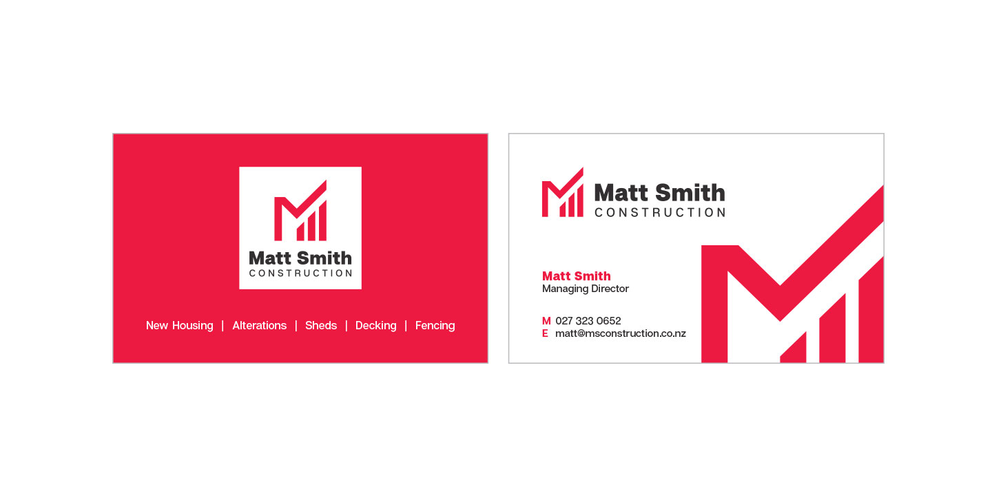
Matt Smith Construction is a relatively new business in the Ashburton area. With a number of established construction competitors also using the first name in their brand name, there was a need to craft a visual identity, which was fresh, memorable and punchy.

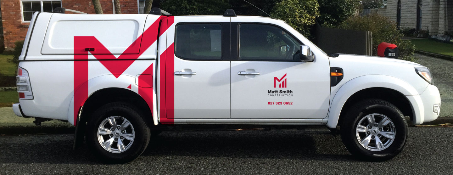
Considered thought was given to the colour palette and development of the icon to make sure it was eye-catching, memorable and unique. Red was chosen, as it is a highly visible colour that is able to gain attention quickly, allowing all signage to be visible and stand out from the rest. Red is often associated with leadership, strength, action and energy which are all traits of Matt Smith Construction.

Matt Smith also wanted the brand to give a sense of the company’s values, which include professionalism, high quality workmanship and a small team focus. The collateral that was crafted included the design of business cards, design of a services site sign and vehicle signage. The website domain name and email address were also secured.

At JFM Marketing + Design, we love being involved with setting up the brand identity and collateral for a new business. If you would like to discuss a new brand identity and logo for your business, give us a call.

VeeHof event: an outstanding success

At JFM, we do a variety of design and marketing tasks to help our clients achieve their business goals. VeeHof Dairy Services Ltd were looking at running a Hoof Care Expo for Farm Owners, Farm Managers and Share Milkers. We discussed what their objectives were for the event, what they needed and what success looked like. JFM reflected on this information and the target market.

We assisted by creating the following support materials:

  • An event plan: to give a run down on what preparation was needed for the day and what would happen on the day.
  • An event invitation, which was distributed to selected farm boxes: the wording, design and printing materials were all chosen keeping the target audience in mind.
  • Updating and reprinting brochures for goody bags: when you have an event, it’s always really important to consider what information you are giving out and ensuring it’s up to date.
  • Ordering nametags: nametags provide direction to attendees as to whom to go to with questions and look really professional.
  • Road signage: due to VeeHof’s prime location on State Highway 1, large roadside signage was displayed so people knew about the event.
  • Media release and adverts: to reinforce the print invitations that were distributed, JFM created a media release which was picked up by media outlets and designed print adverts in specific publications read by the target market.
  • Website update with graphics: we created a new post on the events section of the website informing readers about the event. We also created a website header graphic, which redirected to that page when clicked.
  • Taking photographs and doing a social media post on the day: the staff at VeeHof were busy interacting with clients and generally making the event successful, so JFM took some photographs to capture the day. We also created a Facebook post to display the event photos and thank people for their attendance.

This free event was highly successful, with approximately 70 people in attendance. With a seminar, variety of hands-on demonstrations to watch and participate in, as well as a free lunch, attendees also stayed around for a few hours. When planning events, the key to success is considering what the target audience are interested in and how to best reach them. You need to be strategic and deliberate in your approach. If you ever need assistance with an event, give us a call at JFM Marketing + Design.

Dance into the new year with this vivacious and appealing reddish orange

Tangerine Tango – Pantone 17-1463

“Sophisticated but at the same time dramatic and seductive, Tangerine Tango is an orange with a lot of depth to it,” said Leatrice Eiseman, executive director of the Pantone Color Institute®. “Reminiscent of the radiant shadings of a sunset, Tangerine Tango marries the vivaciousness and adrenaline rush of red with the friendliness and warmth of yellow, to form a high-visibility, magnetic hue that emanates heat and energy.”  Over the past several years, orange has grown in popularity and acceptance among designers and consumers alike.

Typography still rules!

Custom typography is among the leaders for graphic design trends 2018. Actually, this trend has been one of the leading trends for several years and it’s not going down any time soon. Here’s some typography trends to keep an eye out for in 2018!

Creative typography
When it comes to this technique, imagination is your strongest asset. Creative typography can be combined with other techniques or used solely in the design. It impresses in both cases.


Cropped Typography
Cropped typography was a hot trend for 2017 and is still hot for 2018. The art of erasing parts of the letters while still keeping their readability requires a lot of creativity and professionalism. The effect is 100% worth the effort.


Chaotic Typography
Chaos was declared one of the top trends for 2017. It seems that for graphic design trends 2018 it will translate into a chaotic typography. In other words, say “No” to aligning and “Yes” to the unconventional order of letters and words.

Typography as Real Life Elements
A modern graphic design trend is typography tightly interacting with other elements of the composition. The achieved effect is: letters turned into real-life objects.


Rough, defiant and doesn’t always follow the rules

Konkret by Typocalypse

Konkret, a bold new display typeface.
With distinctively sharp-edged, unconventional letterforms as well as additional alternate forms, it’s predestined for large-scale applications.  Konkret is rough, defiant and doesn’t always follow the rules. Konkret is a geometric, uppercase typeface family designed for contemporary typography and comes in eight weights, plus kontra-italics.  As an uniwidth typeface, each letter occupies the same space in all weights.

Want to find out more? Visit www.konkret.wtf.