Quote of the Month…
“Good marketers see consumers as complete human beings with all the dimensions real people have.”


“Good marketers see consumers as complete human beings with all the dimensions real people have.”

We have recently just finished an exciting brand building project with Argyle Welsh Finnigan.
AWF wanted a creative way to keep their team engaged with the transition period involved in moving premises. We suggested a visually striking timeline with unique “repositionable” sticker elements which allowed for information to be adjusted across the timeline. For a staff only message, the information on some of the stickers included key milestones in the building project while other stickers carried specific meaning for team members. By using the milestone stickers only, the timeline graphic also became a fantastic way to keep AWF clients informed of progress on the move.
The flexible messaging and visual potential of this signage method can be used in many different ways. Directional instructions, engaging and ever-evolving communications with the team or just a fun visual you can play with. In working with AWF on this project, we found this re-positional signage to be a highly interactive way to show your team where you are and where you need to be.
When values align between two businesses, the results can be spectacular.
JFM was honoured to be invited to work with Georgina Torrington on a new brand identity project with Continental in Rangiora, Canterbury.
As soon as we met the Continental team, we realised their passion for excellence and drive to create a unique, positive experience for the people they deal with was going to line up perfectly with the way JFM likes to work. In constructing a new facility, Continental envisaged a unique café that would attract visitors from far and wide. Knowing the Continental team has been held in high esteem for the past 50 years, we absolutely believed in their vision. So we set about creating an identity and communication which matched the promised delights for café visitors.
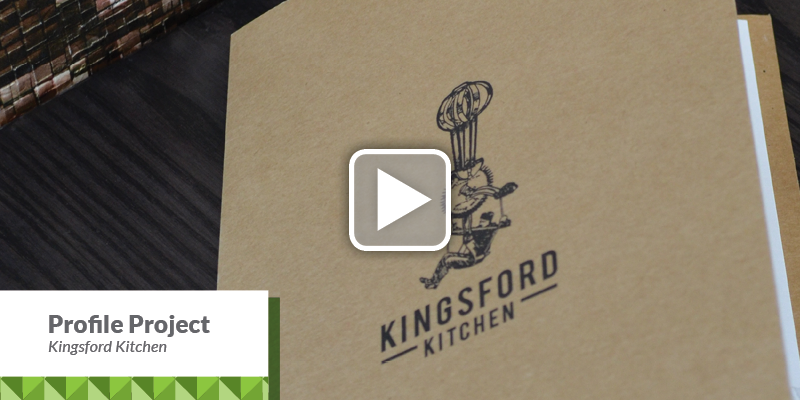
The Kingsford Kitchen brand identity is a delightful creative brain implosion. One minute the creative concept was dwelling on kitchen utensils which suggested hand-crafted quality, the next minute somebody noticed how much a sketch of an upturned egg beater looks like a Da Vinci flying machine… which segued perfectly into the cafe’s name. Kingsford Kitchen is located on Kingsford Smith Drive, named after legendary Australian aviator Charles Kingsford Smith who landed near the location in 1928 on the return leg of the first ever Trans Tasman flight. With those realisations cleared for take off, there was nothing else to do but illustrate a pioneering pilot flying an egg beater.
Click here to see the video clip to find out how JFM developed the corporate logo and brand identity for Kingsford Kitchen – Rangioria’s latest start-up cafe.

Use ‘attraction marketing’ and not pursuit marketing
I am sure you will have noticed what happens whenever a beautiful woman or a handsome man walks into a crowded room or a bar? People look at them. In fact, some people will actually walk over to them and offer them a drink or strike up a conversation with them. The reason we call these kind of physically striking people ‘attractive’ is that they literally attract the attention and also the interest of other people.
So, you might be wondering at this point, what this has to do with you and your marketing? The most successful businesses ALL use the same power of attraction I just highlighted, in order to attract sales, clients readers or customers. The most successfully marketed businesses gain the attention and interest of potential clients by making themselves attractive.
For example:
A blog, once someone reads the blog and finds it “attractive” they recommend and forward it to their contacts, their colleagues and their friends.
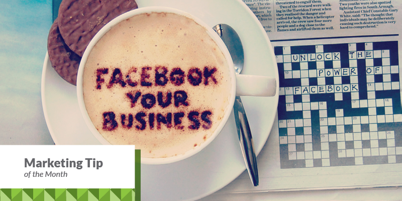
Know your Facebook audience
Use Facebook Insights to find out the demographic breakdown of your audience. This data is useful as it gives you insight about content that resonates the most with your audience, and what communication style your audience responds to the best.
Don’t focus on selling on Facebook
One of the main reasons why Facebook is changing its algorithm is because more and more businesses are posting sales-driven content, as opposed to resourceful content that will provide value to their audience. Facebook is trying to steer away from this model, as they want to make Facebook’s user experience more enjoyable. Therefore, if businesses are prompted to change their Facebook marketing strategy, there will be more valuable content given to their audiences.
Post your best content on Facebook
Facebook wants people to see only the best content on their News Feed. Which means that in order for a business to see engagement on their posts, choose content that has been successful on other social media channels or your business’ content marketing platform. Content that has the most retweets, clicks, and traffic will more likely also do well on Facebook (and remember the golden rule: the best content is the content that provides your followers value).
Empower your employees to engage with your Facebook page
One of the simplest way to increase your Facebook organic reach is to empower your employees to engage with your Facebook page. The more engagement, likes, shares, clicks, your Facebook posts receive the more you can increase your Facebook organic reach.
Don’t forget to respond
If you want to receive engagement on your Facebook Page, you need to also engage with your audience. If you receive a comment, reply to that comment; if you receive a post on your business Page, reply back to that post. Adding the human touch can help your Facebook presence drastically.

JFM has recently undertaken a signage project that ‘moooooooves’ all around the South Island.
Woodley’s Transport, from Geraldine were in need of some vehicle signage that stood out from the rest – and matched their new long stock truck.
Check out our video here, of the process, workings behind and the finished result.
Click the video clip to find out how JFM developed the corporate logo and brand identity for Kingsford Kitchen – Rangioria’s latest start-up cafe.
If you would like to find out how we can support you and your business in it’s marketing development, lets chat today! Creative Director, Jo Foster or Senior Creative, Nik Sweeney direct on 03 308 6272.
Click the video clip to find out how JFM with execution by a local sign writer took a loose concept and brought it to life for Woodley’s Transport of Geraldine, a South Canterbury Transport and Contracting company who strive for top professional presentation and execution in everything they do.
If you have a small or out of the box signage idea, lets talk. We’re here to help bring ideas in to action and make a lasting impression on your customers. Contact Creative Director Jo Foster or Senior Creative Nik Sweeney direct on 03 308 6272 to hear the Woodleys’ story firsthand.

Much like the fortified wine that gives Marsala its name, this tasteful hue embodies the satisfying richness of a fulfilling meal while its grounding red-brown roots emanate a sophisticated, natural earthiness.
This hearty, yet stylish tone is universally appealing and translates easily to fashion, beauty, industrial design, home furnishings and interiors.
The Versatility of Marsala
– Equally appealing to men and women, Marsala is a stirring and flavorful shade for apparel and accessories, one that encourages color creativity and experimentation
– Flattering against many skin tones, sultry and subtle Marsala is a great “go-to” color for beauty, providing enormous highlight for the cheek, and a captivating pop of color for nails, shadows lips and hair.
– Dramatic and at the same time grounding, the rich and full-bodied red-brown Marsala brings color warmth into home interiors
An earthy shade with a bit of sophistication, texture is the story in print and packaging. A matte finish highlights Marsala’s organic nature while adding a sheen conveys a completely different message of glamour and luxury.
Trend , Trend Hand Made & Trend Rough is a font made of layers, taking as a basis a sans anda slab font.
It is the result of observation, search and study of the last global trends. Trend tries to capture the aesthetics of fashion or even fashion itself, integrating elements of a very popular and current trend.
It is a typeface designed to be used without need to add anything external to it, because it has all components required for this.
Trend is trending.