Mail Chimp and Facebook Ads, together at last!

Mail Chimp is an online tool to build attractive emails to send to your customers. The system templates allow people to create well-designed eDM’s (electronic direct mail) to send to their email list of customers.

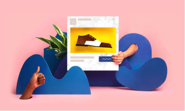
Mail Chimp has now partnered with Facebook for Ad Campaigns. This means, if you already use Mail Chimp and are thinking of using Facebook Advertising, life just got a whole lot easier! You can use the same interface you know and love to build your Facebook Ads.

This relationship is a great idea for small business, as users of Mail Chimp will already have their photos and customer details loaded into the system. The reporting tools of both platforms are integrated, so you get smarter data to give you an idea of return on investment.

For more information on this feature, read the blog post from Mail Chimp here. If you would like to use email or Facebook Advertising as a tool for your business but would prefer we implement it for you, give us a call at JFM Marketing & Design.

Functional and expressive…

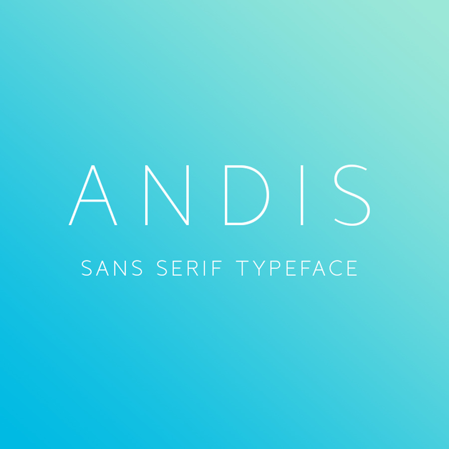
Font of the month  – Andis
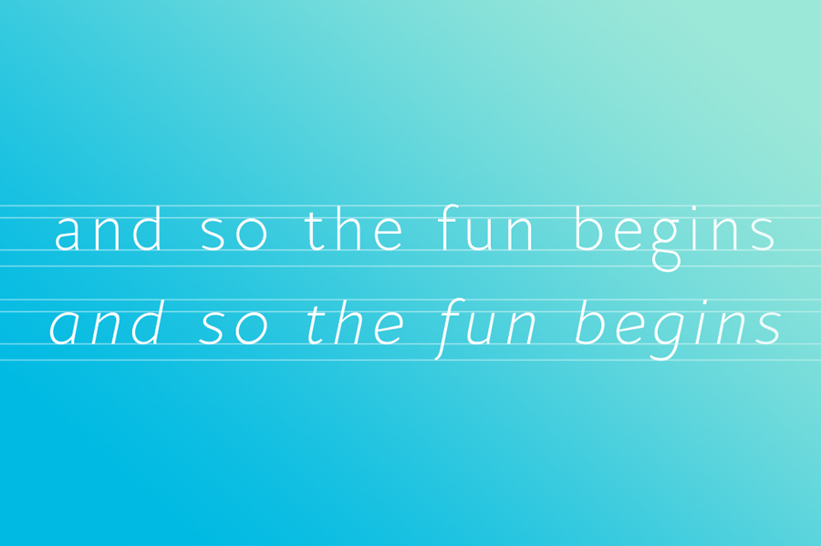
Andis’ rough cut makes it an interesting display typeface, but thanks to its generous x-height and firm serifs, Andis works equally well in text sizes. The typeface’s idiosyncratic italic builds a strong contrast with the roman. Andis is both functional and expressive; using it lends a humanistic touch to editorial or advertising work.

Click here to view more.

Train people well enough so…

Quote of the Month

“Train people well enough so they can leave, treat them well enough so that the don’t want to.”
– Richard Branson

Crafts inspired trends…

A Tale of Two Design Trends…Will You Choose Pattern?

2017 is going to be a year of individualism in graphic design. Flat design was a very welcome addition to graphics last year, helping to simplify layouts and improve user experience, but it became so popular that it now feels saturated. This year we’ll see more arts and crafts inspired trends, and pattern and print will return in a big way.

For packaging and brand design, bringing together the best qualities of flat design and pattern will create vibrant, colourful products which feel at once both ultra-contemporary and artistic.

Greenery is nature’s neutral…

Greenery – Pantone Colour of the year (15-0343).

What is the PANTONE Colour of the Year?
A symbolic colour selection; a colour snapshot of what we see taking place in our global culture that serves as an expression of a mood and an attitude.

A refreshing and revitalising shade, Greenery is symbolic of new beginnings.
Greenery is a fresh and zesty yellow-green shade that evokes the first days of spring when nature’s greens revive, restore and renew. Illustrative of flourishing foliage and the lushness of the great outdoors, the fortifying attributes of Greenery signals consumers to take a deep breath, oxygenate and reinvigorate.

Greenery is nature’s neutral. The more submerged people are in modern life, the greater their innate craving to immerse themselves in the physical beauty and inherent unity of the natural world. This shift is reflected by the proliferation of all things expressive of Greenery in daily lives through urban planning, architecture, lifestyle and design choices globally. A constant on the periphery, Greenery is now being pulled to the forefront – it is an omnipresent hue around the world.

Click here to find out more.

Our Recent Client Work

Our Recent Client Work

Check out what some of our clients have done recently;
jfm-advertising-and-design-news-2016-may-b-2
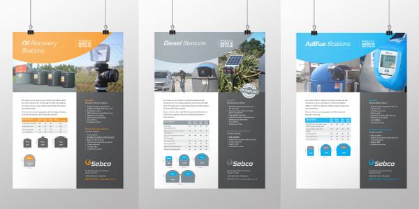
Brand – Sebco brand refresh Requirement:
As the business has grown and evolved the brand needed to reflect this and todays market.
jfm-advertising-and-design-news-2016-may-b-
Promotional items – Vision Insurance Requirement:
Needed promotional items giveaways for clients and tradeshow. The wine knives and golf balls were specifically for the members of the Bed and Breakfast Assn conference.

jfm-advertising-and-design-news-2016-may-b-3

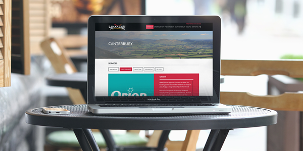
Website – Lemacon Requirement:
To create a story about how they do business within different regions, matching the regional requirements.
jfm-advertising-and-design-news-2016-may-b-4
Website – YOA Requirement:
Presenting a profile of the services and online products utlised by YOA and their clients.
jfm-advertising-and-design-news-2016-may-b-6
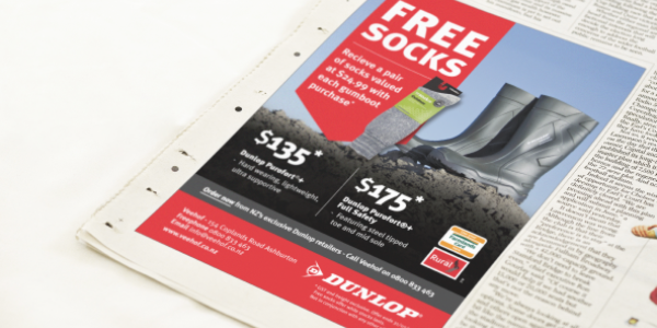
Advertising – Veehof Requirements:
 jfm-advertising-and-design-news-2016-may-b-5
Advertising – Laing Properties Requirements:
To build a brand presence in the Canterbury media.
I would love to know what you think of our new look E-News or what you would like to see in here so drop me a line or give me a call.

Influence how consumers view your brand

The importance of typography in branding

If you think a detail such as typography won’t influence how consumers view your brand, you better think twice. Typography is nothing short of an extension of the brand’s voice and tone. Here are the most significant reasons why typography should become a part of your branding strategy:
It reflects brand personality
Typography communicates the style, tone and voice of your brand – in short, its entire personality. Unique typography conveys a clear message about your brand as one that cares about details and has a strong appreciation for aesthetics.
It helps your brand to be consistent
The same font and typeface in both digital and paper marketing materials will help your brand image resonate stronger with your clients. A characteristic typography can become a feature to enable consumers to immediately recognise your brand.
It helps consumers to remember your brand
Both in logos and text bodies, typography can become integrated with your brand in the public imagination. It can be about shape, but also about colour.
It’s there to set the right tone
Typography will help you create the right atmosphere and invoke a set of associations you want consumers to have with your brand. Whether you go for eccentric and playful or serious and reliable, your brand values can be reinforced with the right typographic setting.  
It creates a context for your brand
Every typestyle has its own unique history and you can use this to your advantage to situate your brand within a context your target audience will appreciate. Use it wisely – a typography that alludes to the classic print ads from the 1950’s will push a brand identity in a completely different direction than a typestyle inspired by graffiti tags on the subway.

Connect with your audience in a genuine way

The year of genuine imagery

For a long time, the web has been suffering from cheesy and fake looking stock photography with super happy people wearing perfect smiles and suits. Thanks to communities, like Unsplash, Picjumbo, Death to the Stock Photo, designers now can utilise beautiful and, most importantly, natural looking photos for their web designs or blog posts. 

We’ve seen many websites using photos from Unsplash and it simply looks amazing.  “Users pay close attention to photos and other images that contain relevant information but ignore fluffy pictures used to “jazz up” Web pages.” – Nielsen Norman Group  The Nielsen Norman Group eyetracking studies have shown that people generally ignore cheesy and artificial looking photos. However, 2016 is the year of genuine imagery and you should take advantage of using real photos to connect with your audience in a genuine way.

What’s in a Name?

What’s in a name?

Long ago, Shakespeare suggested that a rose would still smell like a rose, even if it was named something else. It’s hard to argue with that logic – even though Shakespeare was using the rose to explain how Romeo’s family surname shouldn’t be important. It’s also hard to argue with Juliet’s observation about emotions overpowering superficial descriptions.

Stepping back into the language of today, we are bombarded by so much communication that we rarely have time to look into the hidden meanings behind every word we encounter. Without more information, a rose is a rose is a rose. Unless a name quickly stands out and resonates with us at some level, it is forgotten against the background clutter.

In business, choosing the right name becomes another powerful way to connect with people – to quickly give them more information so that they conjure up a mental picture and remember the emotional associations with that name. For instance, renaming a generic rose “The Valentines Rose”, suddenly causes grown men to panic and order a delivery from their nearest florist.

The reason for all this talk of romance, is that JFM is honored to have worked closely with Toni May in developing a new brand identity for one of New Zealand’s most respected wedding and event services.

For a number of years, Toni and Peter May’s highly successful marquee & event hire business has been seen as part of the Peter May brand name. While both aspects of the business deliver the same superior quality and service, the marquee and event hire service has become renowned in it’s own right amongst wedding and event organizers – no doubt due to Toni May’s leadership, elegant attention to detail and ability to bring her customers dreams to life.

Throughout Toni May’s journey with the marquee and event hire business, delighted customers often refer to the experience being perfectly magical and delivering so much more than the average hire service. This prompted Toni to ask JFM for an objective analysis of an important question – did the name “Peter May Marquee & Event Hire” effectively share the story of what customers could expect from her team?

Without giving the secrets of our methods away, JFM worked with Toni to delve deeply into many aspects of what success looks like for both sides of Toni & Peter May’s business. We found the angles on the angles. We analyzed the structure of each side of the business and how each is perceived by their target market. We looked back at products and services and established an ideal tomorrow. Toni even helped us talk with her customers until we understood the common essence of their experience.

Its incredibly difficult for anyone to be objective about the outside view of their business because they’re usually working hard in the middle of it. In Toni May’s case, JFM worked to paint a clear picture of the facts as they stood, both from the business and customer perspective, knowing this would help Toni decide on future directions.

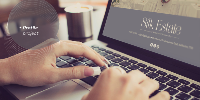
All things considered, JFM recommended a rejuvenated business name which would present a more accurate promise of the customer experience. We presented a few possible name options, but Toni instantly felt a connection with “Silk Estate” – which was designed to evoke customer descriptions of feeling like they have just walked into a sumptuous and exclusive room when they enter one of the elegantly decorated marquees.

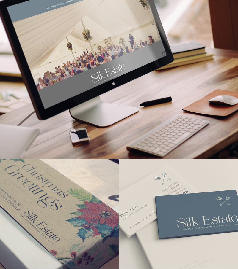
The new Silk Estate logo is designed to visually represent the values which customers associate with the experience of interacting with Toni May and her team. Elegance, attention to detail, unmatched quality and the reassurance of a perfect result.

So far, the new brand name and logo design has met with enthusiastic reactions from those who encounter it. We’re delighted with the process and the results, and feel honored that this project has ultimately reflected the excellence which Toni May has dedicated to her business.

Click here to view the Silk Estate website.
Summer day in autumn for the Methven A&P Show

Methven A & P Show

Again Mid Canterbury turned on a summer day in autumn for the Methven A&P Show.  

We had a number of clients who attended the show.  Below are a few photos of their displays.