Pantone is excited to Announce the Creation of “Love Symbol #2”

Created in honour of international icon, Prince, “Love Symbol #2” is a distinctive blue based purple hue inspired by Prince’s custom-made Yamaha purple piano which was originally scheduled to go on tour with the performer before his untimely passing at the age of 57.

Prince’s association with the colour purple was galvanised in 1984 with the release of the film Purple Rain, along with its Academy Award-winning soundtrack featuring the eponymous song.

With the excitement of red and the tranquility of blue “Love Symbol #2” conveys an aura of mystery, intrigue and unconventionality, a colour that stands apart from all others, something Prince, a performer of distinctive style certainly did.

Click here to read more about “Love Symbol #2” on the Pantone website.

Duotone, a vibrant new trend

The next big image trend is here, and it’s vibrant, colourful, and beautiful! Thanks to Spotify, duotone is growing in popularity almost daily.

Consisting of two contrasting colours, there is no chance that this kind of design will go unnoticed.

The name and technique comes from printing presses. Duotone prints are made in two shades of the same colour or with black and one tint. The process uses two colour plates made with the screen set at different angles.

The technique that was once a print staple has found new life online, and is a trend that we are likely to see a lot more of in the months to come.

Beautiful bespoke garments by Christine Reeves

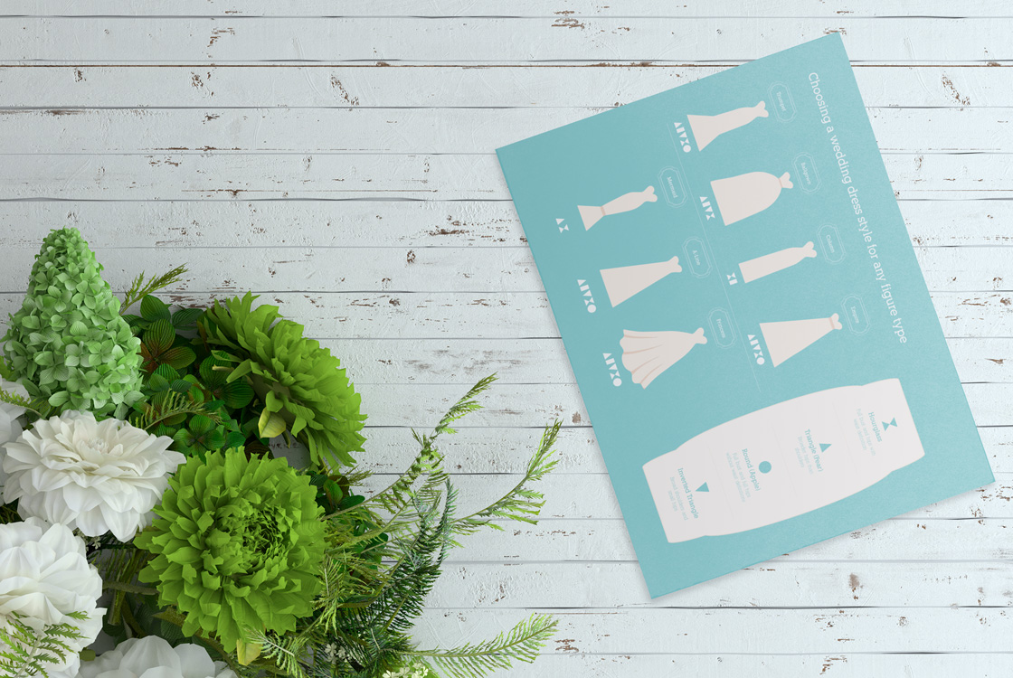
One of our clients, Christine Reeves makes the most exquisite wedding dresses for all types of wedding themes and personal style preferences for brides from diverse cultural backgrounds. As we got to know Christine, we got to see her passion for her craft and how much pleasure she gains from seeing that special smile on a brides face when they try on their dream wedding gown for the very last time before their big day. Christine also creates bridal party outfits and bespoke corporate wear.

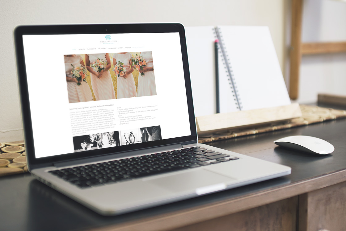
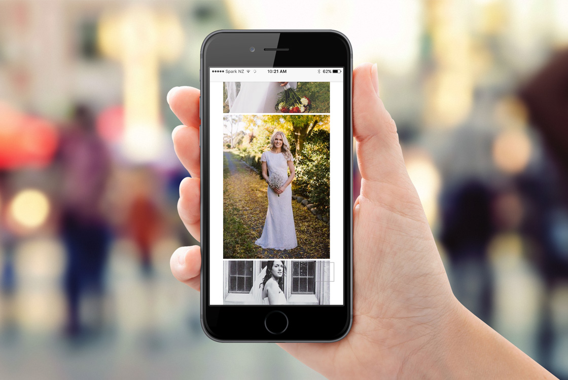
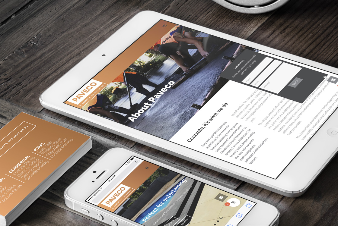
During our consultation, we were briefed to create a digital strategy for Christine, give her some pointers and to consider her audience. We started by assessing the photography she had on hand and selecting those that showed her range of talent, as well as the diversity of her audience.

We dedicated a page to “the journey”, which explained the thorough consultation process that occurs over several weeks between Christine and her clients. This can include Pinterest boards, family members, swatches of fabric and magazine clippings. Christine also sources her own fabrics and laces from master textile producers from all over the world.

JFM Marketing + Design thoroughly researched keywords, to ensure that the website lists well. We wanted to make sure we really captured the essence, talent and dedication to customer service offered by Christine. Our design needed to be clean, fresh and classic to emphasise the high quality, unique products hand tailored by Christine. If you are a specialist looking for an agency that can work with you to articulate your craft online, contact JFM Marketing + Design.

A new fresh brand and website for Paveco

Paveco offer high quality concrete products to clients and pride themselves on customer focused professionalism. When engaging JFM Marketing + Design, Paveco explained that it was time for a refresh. They were looking to develop a new modern brand that looked fresh, streamlined, memorable and made a statement in the market. The new brand had to still have connections to the original brand, so as not to confuse existing customers and to respect their 14-year history.

Considering these requirements, our creative designer modernized the font selection and introduced a new primary colour; rose gold. This colour represents classic elegance, sophistication and high quality finishes. The new logo and branding presents a professional, polished and contemporary face to the market. The font of the logo was still in uppercase to link it to the previous logo, and the tagline “Concrete, it’s what we do” was added to clarify the offering to new clients. Their original orange was considered and the new rose gold colour was the new rich, evolved colour.

A suite of new materials was created to support the launch of the new brand identity. This included new vehicle signage, building signage, stationery and a new website.  These items all rolled out as one for a seamless process and hit the market at the same time. The website was designed to reflect their brand, quality products, values and their client-centric approach to doing business. A simple envelope is shown on every page which expands when clicked, making it easy for potential clients to get in touch. If you think it might be time for your business to be rebranded, contact us at JFM Marketing + Design.

Orange – Radiant and Fun Loving

17-1450 Summer Fig

From sweet smelling peach and energising coral to vibrant tangerine, spicy ginger and earthy terra cotta the meaning of orange is inexorably linked to the sensations of radiant energy, heat and the glowing presence of the setting sun. Taking its heat from two radiant sources, red and yellow, orange is perceived as the hottest of all shades. No matter where or how it is used, even a small touch of vitamin-enriched orange adds liveliness to any colour palette.

One of the orange shades in the 210 new colour additions to the PANTONE colour palette is PANTONE 17-1450 Summer Fig, a lush and juicy orange shade whose slight brown undertone conveys an exotic touch. Suggestive of sweetness and vitality the persuasive and flavourful Summer Fig blazes with intensity.

Find out more from Pantone, click here.

Most important part in creating an outstanding design

Big, bold & beautiful typography

Typography is maybe the most important part in creating an outstanding design. This year typography will be bold and big with statement titles.
The combination between text and photography is really hot right now. They work really well together and it creates a contrast between them.
Take a look at these great examples…

Number 15 in the best selling fonts

Avenir® Next Pro

Avenir® Next Pro is currently placed number 15 in the best selling fonts. The word Avenir means “future” in French and hints of the fonts clean, minimal, modern design. The Avenir® Next Pro family is made up of designs with gradual weight changes in order to satisfy the needs of specific text applications. This allows the font to be used in various applications.

One of the biggest trends right now…

Trend of the month: Colour Transitions
Colour transitions are one of the biggest trends right now.  Beginning in 2016 and growing quickly after, big names like Instagram decided to change their logos and images from a flat colour to a multi-colored transitions. From logos to buttons or picture overlays, this trend is everywhere.

A modern sans serif with humanistic and geometric features…

Font of the month: Kappaby by W Foundry
Kappa is a modern sans serif with humanistic and geometric features. Its structure is slightly narrow to fit in a greater range of platforms (moreover if you print it, you may save a lot of paper), and its height is higher allowing a great legibility in small sizes. This family is composed with the display version and the text version providing a broad spectrum of solutions, making this family easier and friendlier to use. 

Designed with powerful OpenType features in mind. Each weight includes alternate characters, ligatures, fractions, special numbers, arrows, extended language support, small caps and many more… Perfectly suited for graphic design and any display / text use. The 36 fonts are part of the larger Kappa super family.


The story behind an iconic brand colour…

Colour of the month: Tiffany’s Blue (1837 Blue)
How important is colour for a brand expressing their image?
With 80% of our human experience filtered through our eyes, visual cues are vital to successfully getting a message across. More than text or shape, the colour a brand chooses is its calling card. Colour is a signifier, one that commands our attention, and enables companies to establish a brand identity that can become larger than life. It’s crucial when making colour decisions for your brand or product to consider how your shade will broadcast the image of the company. As each colour has its own message and meaning, the more you learn about this critical design element, the more you will be able to leverage its powerful effects.

When was Tiffany Blue standardised by Pantone?
Pantone Colour Institute first began working with Tiffany in 2001 when they approached them to standardise their iconic shade in order to ensure that no matter where you were in the world, no matter the medium the colour was reproduced in, it would be instantly recognisable. The custom colour they created for Tiffany is called “1837 Blue”. It was given this name as the year 1837 marks the founding of Tiffany.