Pixel Play – The design tree that’s taking over

Pixel Play – The design tree that’s taking over

As eight-bit graphics and gaming emerge as popular design choices, packaging designers also look to early digital days for inspiration with ‘Pixel Play’ becoming more and more popular in the design industry

Design elements that define this trend include:
• Use of simple pixel squares to create logos and graphics
• Simple colour palettes
• Bright and bold
• Packaging boxes with die-cut pixels allow a glimpse of the products within.

Geometria – Dynamic elements with a certain degree of stability…

Geometria – Dynamic elements with a certain degree of stability…

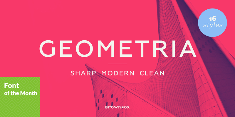
Geometria is a new geometric sans serif. It consists of 16 fonts – eight weights with matching italics.

The vision behind Geometria was to revisit the perennial favourite to lend subtle individuality to its tried and true forms. Geometria stands out in the crowd of similar fonts thanks to its complicated nature. It combines dynamic elements with a certain degree of stability. A slightly higher waistline of the capitals contributes to their distinctive appearance. If the upper case refers to the American grotesques of the 19th century, the lower case tends toward the forms of the Renaissance in its proportions.

Geometria is a typeface of clean shapes that is well-suited for continuous reading, and it sets remarkably well. At the same time, it can be friendly, even flirtatious. Its distinct personality combines seeming opposites. At times it may appear serious, at times playful. On occasion, it may be deliberate, other times dynamic. It could seem rigid, then elegant. It is a typeface that could be perceived either as cutting-edge, or as nostalgic.

Good design can go around corners

Good design can go around corners

One tricky thing about vehicle graphics is that the message is often moving towards or away from the viewer, always at perfectly road legal speeds, officer. So the message needs to attract attention from a distance and leave the viewer with a positive impression once the vehicle has moved along. 

Another tricky thing about vehicle graphics is making sure a design which looks perfect on a one dimensional computer screen, will still look great when wrapped around the contours of real world vehicle panels. Part of solving that problem is designing graphics which work in harmony with the angles of the vehicle shape. But ultimately, achieving a beautifully finished vehicle graphic comes down to working with an excellent sign writer who can take the designers artwork and literally make it measure up against the full scale challenges of panel curves, door gaps, handles and badges.

A picture paints a thousand words, and we designers love the opportunity to use great photos as the central focus of a communication piece. Lucky for us, the team at Jackson Holmes have taken some wonderful images which really help to explain the reality of their business. By selecting a few key images and carefully blending them together, we were able to create a lively visual story about the Jackson Holmes supplementary feed service, and, on a moving billboard, this was much more engaging than a full written explanation would ever be.

JFM is delighted with the final result – and we couldn’t have achieved it without a brilliant sign writing effort from Nathan at Plus Signs and fantastic images from our friends at Jackson Holmes.

Spontaneous and gregarious, PANTONE 15-1247 Tangerine

Spontaneous and gregarious, PANTONE 15-1247 Tangerine

Tangerine is a juicy orange shade that is energizing, yet not jarring to the eye. 

Versatile Tangerine is striking enough to stand on its own and adds vitality to a printed pattern. Good natured and friendly, but with a tangy edge, this fun-loving color invites a smile.

Tangerine pairs Well With:
PANTONE 14-1213 Toasted Almond
PANTONE 16-1720 Strawberry Ice

Logo & Brand Development for Ashworth Automotive

Logo & Brand Development for Ashworth Automotive

JFM have recently completed a logo and brand identity for local mechanic, Ashworth Automotive. 

Starting from scratch, JFM identified the target markets need first to design an appropriate logo and brand elements to connect with the customers. This logo has since translated into building signage, stationary, and marketing material for the launch of the new business and premises. JFM wish Corey Ashworth and the team all the best with the launch of their exciting new business at 59 Creek Road, Ashburton!

JFM attends Marketing to the Rural Sector Conference for 2014

JFM attends Marketing to the Rural Sector Conference for 2014

Jo and Hayden were lucky enough to attend the Annual Marketing to the Rural Sector conference in Auckland last month

Speakers from businesses such as Fonterra, Humes, Waikato Milking Systems, Landcorp, Dairy NZ and many more presented on their take to ‘marketing to the rural sector’.

The top 3 themes that were highlighted were:
• Farmers aren’t stupid. Don’t treat them like they are.
• Technology use – Video & internet.
• Understand their needs first, before selling. They don’t just buy for a reason. It’s a tactical thought process, involving trust and experience. Not the latest and greatest.

We would love to share a coffee and discuss more in depth with you, and how it might give your business the marketing edge. Give as a yodel and lets talk business!

Breath in quirky freshness and create a unique flavour…

Breath in quirky freshness and create a unique flavour…

With Ropa Sans Pro

Ropa Sans Pro is a sans serif font family of 8 weights plus extra designed italics and small caps. While the upright styles pay a distant homage to the technical aesthetics of the early-20th century DIN series, the strongly humanistic italics breathe in quirky freshness and create a unique flavor. Four styles (Ropa Sans, Ropa Sans SC, Ropa Sans Italic and Ropa Sans SC Italic) are available free of charge.

Suitable for both body and headline use, Ropa Sans Pro provides advanced typographical support with features such as case-sensitive forms, fractions, super and subscript characters, and stylistic alternates. It comes with a complete range of old

style and lining figures, witch are in tabular and proportional widths. In addition to an extensive coverage of Latin-based languages, Ropa Sans Pro provides essential support for the Cyrillic and Greek writing systems.