Blown away by a tank

Blown away by a tank.

Sebco manufactures fuel storage tanks. That sounds straightforward enough. But Sebco founders Ed and Leah Harrison are so engaging and so humble that you almost forget their products are light years ahead of anything else in the market. You almost forget that Sebco diesel stations are the ONLY storage tank in New Zealand to be EPA compliant. You almost forget the industry awards presented to Sebco for technical achievement. You almost forget the calibre of the customers they supply across New Zealand.

You ALMOST forget.

When Sebco asked JFM to design new display collateral for a trade show, we immediately took on board everything that Ashburton based Sebco has achieved so far in building their brand. No pressure JFM, no pressure at all. But that’s the way we like it – we believe it’s a real privilege to add our efforts to the momentum of a business.

The project became a challenging exercise in representing the true strengths, innovations and character behind the range of Sebco products. The display collateral needed to demand serious attention in an exhibit situation. It had to demonstrate an advanced level of achievement without blowing it’s own trumpet – something which the Sebco team would never do. In short, the display had to be noticed for all the right reasons, rather than being overlooked as another background player.

We created a visual strategy which would link the three main Sebco products and multiple customer benefits into one BIG story. When placed together, the individual display pieces work together as a visual block to completely claim any space. A “Sebco Wall” effect is created by the linking colours, layouts and simple messages of the banners and counter unit. But, considering the investment involved in banner printing, our design also allowed for the individual pieces to work powerfully as stand alone product displays for future use.

The final display definitely achieved the visual impact we had aimed for, but we were delighted to receive a happy note from Sebco at their trade show saying the display was “fantastic” – followed by a photo of Ed in action.

Click here to view the JFM Sebco portfolio

JFM host a Who! event with keynote speaker Sue Lindsay

JFM host a Who! event with keynote speaker Sue Lindsay

Helping business owners and leaders in my business community is a real privilege, and it’s a personal passion of mine to help build it’s full potential where I can.

On Tuesday 4th November, we were delighted to launch Who! and it’s inaugural event hosted by JFM which was enjoyed by over 25 local clients, business owners and managers.

Over breakfast we had the opportunity to gain real-world insights on leadership and transformational strategy from Sue Lindsay, multi award winning strategist, business coach and international speaker.

I’m delighted Sue’s real world approach to life & business may have not only been inspiring but also motivating…

Take a look over the photographs from the event, or like Who!
www.whoNZ.com www.fb.com/whoNZ

“Thanks for this morning, Sue is inspiring and it was an uplifting way to start the day.”

“Just wanted to flick you a quick email and say THANK YOU for this morning. It was fantastic. Sue is amazing to listen too and I think she gave everyone there some inspiration. I know that she’s given it to (name), she’s literary buzzing around here. And keeps telling the girls what she listened to. She was like a big sponge and taking it all in.”

“Just wanted to say thanks for inviting me along this morning, I really enjoyed the presentation from Sue! PS this email is not pp’d”

“Thanks so much for this morning we both really loved the opportunity to hear about Sue and I am so looking forward to talking to her next week.”

If you haven’t had a chance to read back over your presentation notes, why not make an appointment with yourself this week and take one action – who we need to be tomorrow, starts today! Or if you would like a copy of Sue’s presentation please feel free to be in touch.

The lead into Christmas is busy all round, there’s still plenty of time to complete your last project goals for 2014. If you have an opportunity in mind and you’d like some direction or creative strategy advice feel free to contact Hayden and myself – it’s our objective to be your professional helpful friend in business wherever we can.

Regards,

Jo Foster
Creative Director

Who! is not a question, Who! is an answer

Who! is not a question, Who! is an answer

Skilled leadership can transform business guesswork into an emphatic statement about who you are. Who! gives you access to the inspired minds behind great business.

Who! is a facilitator of keynote speeches and master classes from some of the world’s most successful business leaders. Who! was born from many conversations I have had with businesses and executives. The more I listened, the more I noticed a common want for knowledge about what it takes to transform a local business into a world class brand.

Hosting a Who! event establishes you as a thought leader within your business community. Best of all, we make it easy from the get-go. To find out more contact me direct on 027 292 5004 or info@whonz.com.

www.whoNZ.com
www.fb.com/whoNZ

Minimal Mind

Minimal Mind

Negative space takes center stage in current packaging design trends, according to Stylesight in its Prints & Graphics.

This “Minimal Mind” graphic design trend favors immaculate white space and minimal graphics over decorative graphic design elements.
“Pristine packaging alludes an über contemporary feel,” states Stylesight.

Additional design elements that define this trend include:
– Immaculate white is used as a basis for all materials and packaging
– Minimal graphics and type
– Pure and simple branding
– New organic approach
– Small and subtle pops of color appear through paint drips, tiny circles, type and simple illustrations

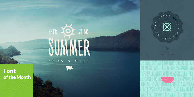
A fun and friendly font for summer

A fun and friendly font for summer

Nexta Rust font family

Nexa Rust from Fontfabric Type Foundry is a multifaceted font system consisting of font sub-families Sans, Slab, Script, Handmade and Extras.

Each of these sub-families contains a number of font weights which have a characteristic warm, rough look and display a few degrees of saturation.

Nexa Rust is a rough version of the already popular Nexa and Nexa Slab families with added new matching Nexa Script and Nexa Handmade fonts.

Along with all of this font family, you will also discover added groups of extras which could serve as a foundation or add that extra “cherry on the cake” to each unique design.

A splash of excitement to the palette…

A splash of excitement to the palette…

“PANTONE 16-4725 Scuba Blue

An invigorating turquoise, PANTONE 16-4725 Scuba Blue conveys a sense of carefree playfulness. Even though a cool shade, the vibrancy of Scuba Blue adds a splash of excitement to the palette. Scuba Blue offers a feeling of escape as it is reminiscent of a tropical ocean. This stirring and energizing shade takes us off to an exotic paradise that is pleasant and inviting, even if only a fantasy.
Leatrice Eiseman – Executive Director, Pantone Color Institute®

Pairs Well With:
PANTONE 19-4052 Classic Blue
PANTONE 14-5714 Lucite Green

The future of brand loyalty

The future of brand loyalty.

Global advertising and ideas company Saatchi & Saatchi has released a Red Paper on the future of brand loyalty. The paper is issued on the 10th anniversary of the best-selling business book Lovemarks the future beyond brands, written in 2004 by Kevin Roberts, the company’s Worldwide CEO.

Rather than seeing the end of brand loyalty, the Red Paper paints a landscape where on one side the hi-tech consumer era makes loyalty easier to lose, yet on the other side easier to win. This is because – through technology and connectivity – brands are better empowered to understand people, get close to them, make friends with them and inspire communities of fans and involvement that can drive loyalty to new heights.

Kevin Roberts said: “The brands that are going to win big will do so because they are loved, which inspires loyalty beyond reason. Tech and hard data are taking us in closer, but the more robotic and targeted marketing gets, the more the win is in the soft human touches. People want empathy, inspiration and love more than ever, which brands have always struggled to create. Brands that deliver the human factor on time, at speed, scale and with the right cost model will succeed.”

While focusing on loyalty, the Red Paper addresses the role of emotion as the brand success factor across a spectrum of measures, including through sales, margins and extendability. The Paper gives brands five actions to succeed in the consumer era.

Click here to view the Saatchi & Saatchi Red Paper

The result – a bright, modern, royal and funky logo and website…

The result – a bright, modern, royal and funky logo and website…

Stepping Out came to JFM, looking for a new unique sense of style for their and logo and website.

JFM identified the target markets need first to design an appropriate logo and brand elements to connect with the customers. Stepping Out has become the leading shoe store in Ashburton showcasing the latest shoe styles and trends and we wanted to show that through their logo and brand.

The result – a bright, modern, royal and funky logo and website. Click here to view the new Stepping Out website.

We’d love to talk about what we can do for you. From brand repositioning and refreshing, right through photography, print advertising, and strategic marketing plans – click and commence your advertising and marketing journey with JFM today…