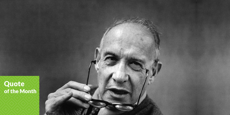
Peter May – Ruralco Marketing Excellence Award 2014

Peter May – Ruralco Marketing Excellence Award 2014

Marketing execution pays off. Toni and Peter May have recently been awarded the Marketing Excellence Award for 2014 at the Annual Ruralco Awards Dinner.

Toni says that, “Because so many small businesses are so busy doing what they do and most don’t have the expertise to understand initially these concepts, we were helped along by local marketing firm Jo Foster Marketing (JFM).

Jo and her team have drawn us into this millennium and assisted us to embrace new technology and concepts we wouldn’t have had the knowledge or confidence to try.

They have helped to give us a good understanding of brand concepts and helped us to keep focus and track our marketing goals.”

Logo & Brand Development for Ashworth Automotive

Logo & Brand Development for Ashworth Automotive

JFM have recently completed a logo and brand identity for local mechanic, Ashworth Automotive. 

Starting from scratch, JFM identified the target markets need first to design an appropriate logo and brand elements to connect with the customers. This logo has since translated into building signage, stationary, and marketing material for the launch of the new business and premises. JFM wish Corey Ashworth and the team all the best with the launch of their exciting new business at 59 Creek Road, Ashburton!

JFM attends Marketing to the Rural Sector Conference for 2014

JFM attends Marketing to the Rural Sector Conference for 2014

Jo and Hayden were lucky enough to attend the Annual Marketing to the Rural Sector conference in Auckland last month

Speakers from businesses such as Fonterra, Humes, Waikato Milking Systems, Landcorp, Dairy NZ and many more presented on their take to ‘marketing to the rural sector’.

The top 3 themes that were highlighted were:
• Farmers aren’t stupid. Don’t treat them like they are.
• Technology use – Video & internet.
• Understand their needs first, before selling. They don’t just buy for a reason. It’s a tactical thought process, involving trust and experience. Not the latest and greatest.

We would love to share a coffee and discuss more in depth with you, and how it might give your business the marketing edge. Give as a yodel and lets talk business!

Breath in quirky freshness and create a unique flavour…

Breath in quirky freshness and create a unique flavour…

With Ropa Sans Pro

Ropa Sans Pro is a sans serif font family of 8 weights plus extra designed italics and small caps. While the upright styles pay a distant homage to the technical aesthetics of the early-20th century DIN series, the strongly humanistic italics breathe in quirky freshness and create a unique flavor. Four styles (Ropa Sans, Ropa Sans SC, Ropa Sans Italic and Ropa Sans SC Italic) are available free of charge.

Suitable for both body and headline use, Ropa Sans Pro provides advanced typographical support with features such as case-sensitive forms, fractions, super and subscript characters, and stylistic alternates. It comes with a complete range of old

style and lining figures, witch are in tabular and proportional widths. In addition to an extensive coverage of Latin-based languages, Ropa Sans Pro provides essential support for the Cyrillic and Greek writing systems.

JFM E News August 2014 – Pantone Colour of the Month

jfm-jul-2014-e-news-colour

Dewkist 13-0107

Green is said to be the manifestation of truth, as revealed in deeds and action. It’s the colour of our heart chakra, which rules our ability to love and empathize.

The blending of yellow and blue make this wonderful colour. It’s commonly associated with fertility, spring, growth and the environment, but different greens have different associations. Olive is the colour of peace while dark greens may symbolize ambition, good fortune or envy.

Precious stones jade and emerald are prized in monetary and symbolic terms, while aqua – in jewelry and nature – is the colour of emotional healing. In the natural world, snakes, lizards and many insects use green to mimic the chlorophyll greens of their surroundings.

JFM E News August 2014 – Font of the Month

Loew Font Family

Loew is a geometric sans serif font influenced by the methods of the early industrial designer’s.

Loew is a geometric sans serif font influenced by the methods of the early industrial designer’s. Pure mechanical shapes are carefully adjusted to give the characters the right form, function and usability. These subtle human touches combined with the technical detail provide great readability at both large and small point sizes. Loew is a versatile sans serif font with simple and honest geometry aimed at a wide range of modern applications. Details include over 800 characters with alternative lowercase a, e and g. Seven variations of numerals, true small caps with accents, manually edited kerning and Opentype features.

JFM E News August 2014 – JFM Update

August. The 8th month of the year. Where is 2014 going?

The good news is that the days are getting longer, and we are working our way towards another summer! This month we thought we would share a marketing piece from our friendly Australian neighbours.

Automotive marketers, the bar has been raised, because David Johns of Australian agency Chimney has put together a stunner of an ad to sell his 1999 Holden Barina.

With flames coming from its tyres, it is “style redefined” and “luxury redefined”. We wouldn’t argue with that. It has “matching seats” too. He’s also created a website to show off some digital skills and showcase the car further. And the clip has been popular, racking up over 800,000 views and being featured on a range of websites.

Perhaps its time for your business to take a step out of the box. Time for something different? We’re ready to help!