Ideas in action – How do JFM bring rural signage ideas to life?

How do JFM bring rural signage ideas to life?

Click the video clip to find out how JFM with execution by a local sign writer took a loose concept and brought it to life for Woodley’s Transport of Geraldine, a South Canterbury Transport and Contracting company who strive for top professional presentation and execution in everything they do.

If you have a small or out of the box signage idea, lets talk. We’re here to help bring ideas in to action and make a lasting impression on your customers. Contact Creative Director Jo Foster or Senior Creative Nik Sweeney direct on 03 308 6272 to hear the Woodleys’ story firsthand.

Hearty, yet stylish…

Marsala 18-1438

Much like the fortified wine that gives Marsala its name, this tasteful hue embodies the satisfying richness of a fulfilling meal while its grounding red-brown roots emanate a sophisticated, natural earthiness.

This hearty, yet stylish tone is universally appealing and translates easily to fashion, beauty, industrial design, home furnishings and interiors.

The Versatility of Marsala

– Equally appealing to men and women, Marsala is a stirring and flavorful shade for apparel and accessories, one that encourages color creativity and experimentation

– Flattering against many skin tones, sultry and subtle Marsala is a great “go-to” color for beauty, providing enormous highlight for the cheek, and a captivating pop of color for nails, shadows lips and hair.

– Dramatic and at the same time grounding, the rich and full-bodied red-brown Marsala brings color warmth into home interiors
An earthy shade with a bit of sophistication, texture is the story in print and packaging. A matte finish highlights Marsala’s organic nature while adding a sheen conveys a completely different message of glamour and luxury.

Trend is Trending…

Trend is Trending

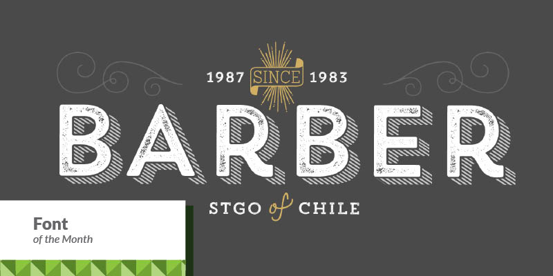
Trend , Trend Hand Made & Trend Rough is a font made of layers, taking as a basis a sans anda slab font.

It is the result of observation, search and study of the last global trends. Trend tries to capture the aesthetics of fashion or even fashion itself, integrating elements of a very popular and current trend.

It is a typeface designed to be used without need to add anything external to it, because it has all components required for this.
Trend is trending.

Incredible detail, but straight lines everywhere…

Super-Geometric

Incredible detail, but straight lines everywhere. If origami was graphic design technique, this would be it.

Don’t be fooled by apparent simplicity though — the level of skill and attention required to produce this kind of work is not for the faint-hearted. That’s probably why this design style is trending, similar to the Handiwork example above.

Inspired by Ashburton Intermediate

Inspired by Ashburton Intermediate

Late last year we were honoured to be asked by Darren Butler, a gifted teacher from Ashburton Intermediate, if we could find time to talk about marketing and design with a few students in relation to a unique project the school was working on.
The possibility of our professional experience being useful to local young minds is rewarding enough, but we were inspired to do as much as we could once Darren explained the “real world” nature of the project, which involved teams of students working  together over the term to develop, manufacture and market a product which would be sold at a Market Day. 
JFM Senior Designer Nik Sweeney initially spoke with the students about fundamental aspects of good logo, packaging and poster design. Cue: blank stares as to how any adult could get so excited about colours. But with some expert coaxing from Darren, a question and answer session soon revealed that some students had a real gift for the marketing and advertising concepts behind the design. One young lady even raised her hand and confidently asked what she should be studying now to get into marketing. True story. Her JFM business cards are being printed as we speak.
To our delight, Darren reported that the students felt they had learned a lot from our presentation. We were even asked to continue our involvement with the project by “judging” the resulting posters, packaging and stall designs. Easier said than done. Upon seeing the clear effort each student team had put into the design and marketing of their products, it became apparent that picking the best of the bunch was going to come down to tiny degrees of difference. With such a close race we felt the only fair reward was an Olympic medal system. The resulting gold, silver and bronze certificates included an explanation of what unique efforts we recognised and made the entry more successful than the competition. 
Visiting the Ashburton Intermediate Market Day itself was a heartwarming revelation. Each team had developed a product based on a different country and the students had entered into the spirit of the event by dressing to match their product. The stall decorations were outstanding and the quality of the student sales people would put any Melbourne or London market to shame. The only fault Nik could find was that he arrived too late to sample all the international foods.
The stalls, happy students, cheerful noise and (no doubt sugar fuelled) atmosphere had visitors totally engrossed in the experience. By all accounts, the culmination of the project was a great success for the students and teachers. Here’s the final word from Darren Butler;
“Thank you for your time and effort as it has made it extra special having a professional give some insight about marketing and critique their hard work.  The event was more successful than anticipated with food selling out by 12.30 (and we had a lot at the start) and many of the stalls just about selling out also (must have been that great marketing advice).  We made about $4600 towards Ashburtion’s cancer society + Cole Beeman raising a similar amount by himself to shave his head, so hugely successful. Thankyou and the team.”

One Month already down…

One Month already down already

2015 feels like its going to be an action packed year, full of new and exciting marketing and strategic projects.
We hope you had a safe and happy holiday season, and welcome you back to another year. January and February are great months to plan any marketing projects for the year ahead and set new goals and objectives. Whether its signage for the upcoming agricultural shows, or help with your strategic direction and brand identity, the JFM team are on board and ready to support. Our goal for 2015 is to be more proactive and responsive to your needs, and will be out and about visiting you more regularly – so put that coffee order in!
Wishing you all the best for another successful year. Talk soon.

Achieving a high standard of building excellence for the last four generations…

McIntosh Builders

Achieving a high standard of building excellence for the last four generations, whether it is agricultural, educational, residential, or commercial, McIntosh Group have it covered.

JFM has recently completed two websites for the McIntosh Group companies, McIntosh Builders & McIntosh PreCast. These slick websites are built responsive, so view well on your phone or tablet, and have specialised restricted access sections to the website for suppliers to view project details, deadlines and guidelines, while also being able to upload their tenders for consideration. Check them out via www.mcintoshgroup.co.nz

Blown away by a tank

Blown away by a tank.

Sebco manufactures fuel storage tanks. That sounds straightforward enough. But Sebco founders Ed and Leah Harrison are so engaging and so humble that you almost forget their products are light years ahead of anything else in the market. You almost forget that Sebco diesel stations are the ONLY storage tank in New Zealand to be EPA compliant. You almost forget the industry awards presented to Sebco for technical achievement. You almost forget the calibre of the customers they supply across New Zealand.

You ALMOST forget.

When Sebco asked JFM to design new display collateral for a trade show, we immediately took on board everything that Ashburton based Sebco has achieved so far in building their brand. No pressure JFM, no pressure at all. But that’s the way we like it – we believe it’s a real privilege to add our efforts to the momentum of a business.

The project became a challenging exercise in representing the true strengths, innovations and character behind the range of Sebco products. The display collateral needed to demand serious attention in an exhibit situation. It had to demonstrate an advanced level of achievement without blowing it’s own trumpet – something which the Sebco team would never do. In short, the display had to be noticed for all the right reasons, rather than being overlooked as another background player.

We created a visual strategy which would link the three main Sebco products and multiple customer benefits into one BIG story. When placed together, the individual display pieces work together as a visual block to completely claim any space. A “Sebco Wall” effect is created by the linking colours, layouts and simple messages of the banners and counter unit. But, considering the investment involved in banner printing, our design also allowed for the individual pieces to work powerfully as stand alone product displays for future use.

The final display definitely achieved the visual impact we had aimed for, but we were delighted to receive a happy note from Sebco at their trade show saying the display was “fantastic” – followed by a photo of Ed in action.

Click here to view the JFM Sebco portfolio