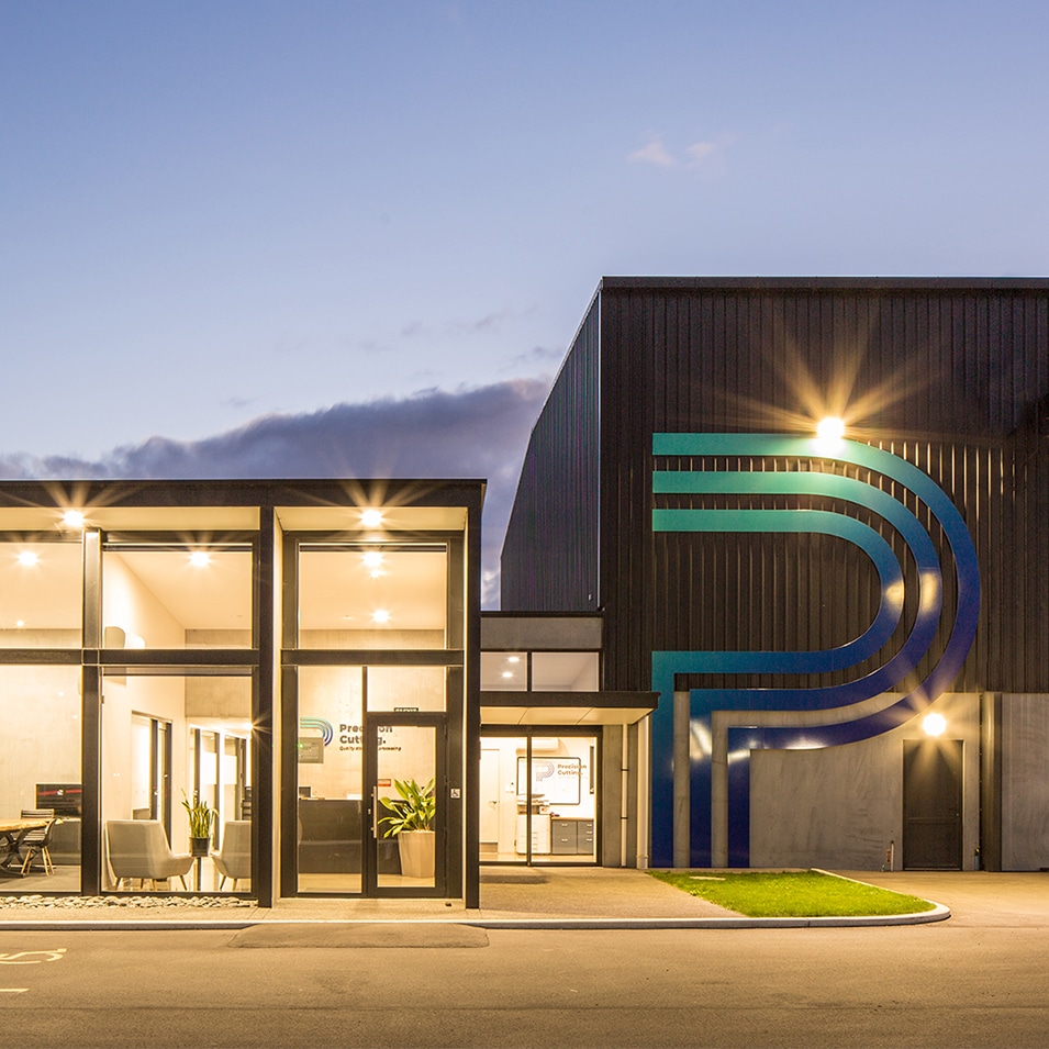
Precision Cutting – Brand Launch

? The Dream We were honoured to deliver a full rebrand for the fabulous Amanda and Josh O’Malley at Precision Cutting. This included logo and brand mark, collateral, signage, and website.

? The Recipe

The Precision Cutting icon has been carefully crafted to represent the quality and premium precision of the steel plate construction at Precision Cutting. The custom stylised ‘P’ icon creates a visual of cutting line work which represents precision, production, and excellence. These visual identities tie to the company values which are driven to achieve the best performance. The colours and gradient we have chosen are drawn from the tempering process. The rich tones of blue convey the feeling of stability, trust, loyalty, precision, and intellect. The full stop makes the brand name an absolute statement. It gives a feeling of assurance and confidence in the quality of their work.

?The Magic

The result is a brand that their whole team and community is proud of, and not to mention a handful of new clients!

*Consistent brand communication across all their collateral and channels

*Improved company reputation and visibility in the marketplace

*Ongoing access to support with all brand updates and marketing needs

New brand launch – Papawai Farms

“Jo and the team at JFM were amazing to deal with and are very professional.  Having never done anything like this before, they made the process so easy.

It didn’t matter that we farm in the North Island, they took the time to ask questions to get know us, our family and the business. With emails, skype, and telephone conversations, these were made to look like it was no hassle for the team.

The ideas they came up with were very exciting for us.  JFM took us to another level and we are getting many positive comments. They got us excited about promoting our business.”

Helen Ellis – Papawai Farms

We were honored to have crafted a fresh brand identity for Papawai Farms, a fabulous award-winning family farming operation in the sunny Central Hawke’s Bay.

It was a true pleasure to work alongside Helen and her family to craft a unique hand-drawn icon representative of their family farming values and a range and supporting marketing tools such as business cards and apparel illustrations. We love getting to know and understand the leaders behind businesses and crafting memorable logos and brands which set them apart today and into the future. If you or someone you know is interested in finding out about how to brand or rebrand their business, feel free to book here https://buff.ly/2MZpIDm and arrange a complimentary 20-minute insight session today.

Growth & innovation

Mainland Minerals, one of our long term clients is always focused on adding value to their farming clients. Recently we were tasked with crafting a print and electronic promotional flyer their sales team could utilise to promote one of the latest product innovations.

Having come from a farming family, Jo McCloy, JFM’s creative director brings to the table agribusiness farming insight that can help present products and services in a manner farmers respond to. If you would like some help with marketing to the rural sector, feel free to book a call with Jo here https://buff.ly/2MZpIDm and arrange a complimentary 20-minute insight session

Autumn 2019

Wow, 2019 has been a colourful and exciting whirlwind here at JFM, what about for you? We have farewells, celebrations, welcomes and some very exciting showcase work to share with you. 

Our rebrand has injected so much new energy into our creative studio and we are all feeling a great sense of momentum from this. How would you like some of our magic dust sprinkled your way?

We would love to hear your next big idea to help you get it off the ground.

Go Well,
Jo

Jo McCloy,
Managing Director
Book A Consultation With Me

Welcome to Tracy and Rosemary

We are super lucky to have two new talented team members join the JFM in-studio team this year. Tracy is our Communications and Operations Manager who started in January and Rosemary is our new Senior Creative who started in May. These superstars have already brought so much passion and expertise to JFM that we feel like they’ve been part of the JFM family forever!

Learn More About Tracy & Rosemary
The Making Of: An Iconic Brand
Sean Lysaght and Glenn Stone tasked us with creating an iconic brand for the evolution of GSI Insurance Brokers. We didn’t just create a logo, we created a brand strategy and identity to be proud of.

The rich deep tones of blue convey the feeling of stability, strength, trust, loyalty, and intellect. Additionally, the tones of yellow gold give the feeling of confidence, optimism and enthusiasm. GSI are part of their clients’ team as their trusted advisor. The GSI icon has been carefully crafted into a refined stylised owl. The owl as a unique brand mark symbolises wisdom, intuition, and guidance. An owl possesses the ability to see what others do not see.

It was both an honour and pleasure to craft the strategy, artwork, digital and print collateral for GSI. The result is a brand that reflects the true value of the GSI service whilst GSI’s network and clients have remarked; they’re suitably impressed!

Book A Rebrand Consult
New Horizons for NZFTS
Our fantastic clients from New Zealand Foreign Trustee Services (NZFTS) came to us for a fresh new brand to align with their exciting new global direction. They wanted something that looks to the future and that represents New Zealand on the world stage.

Our creative brand strategy and identity then began. The tones of blue instill a sense of trust and the memorable brand mark can be viewed as a stylised shape of New Zealand’s land, or an arrow pointing to the future. The lines also draw on associations with the New Zealand flag, bonding the icon with overseas representations of NZFTS services.

Alongside their iconic new brand mark, we refreshed their website, LinkedIn pages and collateral. We also crafted an international brochure along with specialised translation for the Chinese market.

It has been a pleasure to be a part of Jonathan and Penny Cron’s continued global growth and expansion. The result of our work is a new found confidence in their brand and exciting new clients in exotic overseas markets.

Visit the NZFTS Website
Precisely, For Precision
We were honoured to deliver a full rebrand for the fabulous Amanda and Josh O’Malley at Precision Cutting. This included logo and brand mark, collateral, signage and website.

The Precision Cutting icon has been carefully crafted to represent the quality and premium precision of the steel plate construction at Precision Cutting. The custom stylised ‘P’ icon creates a visual of cutting line work which represents precision, production and excellence. These visual identities tie to the company values which are driven to achieve the best performance.

The colours and gradient we have chosen are drawn from the tempering process. The rich tones of blue convey the feeling of stability, trust, loyalty, precision and intellect. The full stop makes the brand name an absolute statement. It gives a feeling of assurance and confidence in the quality of their work.

The result is a brand that their whole team and community is proud of, and not to mention a handful of new clients!

Visit the Precision Cutting Website
The Roots of DNA Hairdressing
DNA Hairdressing Testimonial
Get The Scoop On JFM Web Design
We were thrilled when Kim from Mid Canterbury salon DNA Hairdressing approached us for a website refresh. Then we were over the moon with the amazing testimonial Kim kindly let us capture on video. Watch it by clicking the preview above.

DNA had evolved so they asked us to refresh their website to show their superior offering in the marketplace. They needed a beautiful, yet functional website. We designed a website that shows them as leaders in their industry. We conducted keyword research and wrote SEO copy to help them stay in favour with Google search.

They now have a clean website, clarity and content that’s high quality and can be used over and again in their digital channels and collateral.

Visit the DNA Hairdressing Website
Jo’s Rebrand Journey

Last month we interviewed Jo to get the scoop on why she rebranded JFM and how she did it. The interview was published in the Ashburton Guardian. Read below for one of the key takeaways from Jo’s interview.
“Branding is showing that we are clear about what we truly desire and crafting this exact vision into reality for yourself. It’s about holding up the mirror and being honest with yourself and saying, ‘for my fire to be lit every day I need to be making a meaningful contribution’. So ask yourself, does my brand inspire me to do that?”⠀
More Insights On Jo’s Instagram
Sign Network JFM Rebrand
Watch How Our Signage Was Created


SIAFD 2019 is here

With the biggest agricultural show of the year just 9 weeks away, now is the perfect time to get your marketing and promotional requirements printed, packed and show ready.  JFM Marketing & Design has a fantastic selection of print and promotional items for you and your team, everything you will need for a successful field day show.

We can provide a full design and print service for:

  • Business cards
  • Flyers/brochures
  • Flags
  • Pull up banners
  • PVC banners
  • Corflute signage
  • Promotional items – pens, clothing, gadgets and gifts

As well as:

  • Social media marketing campaigns
    Maximise your Online Potential
  • Engage your audience
    Video Campaigns and Testimonials
  • Personalised Posts
    Invite New and Current Clients to your site
  • New Client Data Collection
    Introduce your company with a personalised client detail form and automated welcome emails
  • Competitions
    Personalised entry forms and posters – Digital and Print
  • Social Media Brainstorming
    Instagram imagery | Build Anticipation

Workplace Selfie Comp V2

We relished your entries to this Facebook comp earlier in the year so much – that we brought it back! The winner of the Workplace Selfie Comp V2 was DNA Hairdressing. We loved the creativity in this entry and appreciate that it probably took a few shots to get everyone in the frame!

Let us know – should we run this comp again in 2019?

Facebook No-Go’s and Oh-No’s

When you hit the go button on a Facebook post, Facebook rates it – so to stay on Facebook’s good side, we’re here to help you.

We were shocked when we found out Facebook doesn’t like when:

  • You use the words like, tag, share or sale (and any other overly promotional words – thats why we say liker, react or tell us)
  • You insert a link into your post (that’s why we always link in the comments)
  • You don’t use an image in your post
  • You repeat the same content

Are you surprised as we were to learn this?

Who’s Dolly?

Our clients Alliance know that brand building takes time and after 70 years, they’re experts at playing the long game. They know that connecting with generations of families is important for keeping their business sustainable.

For the kids, they’ve created a cute wee character called Dolly the sheep. Inspired by Where’s Wally? we helped them create Where’s Dolly? Along with a high quality activity book that children and families can bond over and cherish together.

As always, we also got a real kick out of helping Alliance design a range of elements for their stand at the New Zealand Agricultural Show. We helped them execute high impact mesh banners, wall banners and client invitations and more.

We love our clients and helping them bring their ideas to life!

An Institutional Logo Design

JFM was asked to create an authoritative brand identity for the education training body ‘Dairy Hoofcare Institute’ (DHI) targeting all hoof care training, contract hoof trimmers, vets and the professional sector.

To give the logo a feeling of trust and credibility we have designed the logo using a serif font. Serif fonts are traditional and promote feelings of heritage making them ideal to make brand identity feel ‘established’. Due to the fonts classical nature, it carries the feeling of trust and respect.

To accompany the serif font we have created a crest or shield icon. One of the major benefits of a crest icon is that the shape personifies an idea of safety and security that implies that a brand can always be trusted to provide its customers the very best service. The crest contains the hoof and heads of cattle to convey is special alignment to the dairy sector.

Do you have an idea that needs executing?

Mauger Made Major

When we met the the awe-inspiring brothers Thomas and George Mauger – we knew we had a great project in our hands.

Creating their logo and brand identity was such a pleasure.

The Mauger colour scheme we have chosen invokes a sense of trust, reliability and sense of dependability.

Yellow represents optimism, confidence and energy, which is balanced with blue, bringing the allure of power, trust, dependability and professionalism. The types of yellow and blue were carefully selected to uniquely communicate the values of the company.

The strong, bold colour pallet inspires confidence in Mauger as a company and the wider team.

Are you ready to take your brand to the next level?